Highlighting and Shading Mistakes that even Expert Miniature Painters Make
I am often amazed at the skill of other miniature painters. I am amazed at their precision, deft touch and patience with the painstaking multi-layered processes they apply.
Just as often I am equally amazed at the wonky choices for colours that these same painters make when shading and highlighting. What follows is a guide to what they, and possibly you also, are doing wrong. Why it is wrong and what to do about it.
How Light and Colour Works in Real Life
We will not go deep into the physics of light but to understand light and colour we do need to know a few things about it. Light is a wave, as well a particle. In its wave-like properties it has frequency and amplitude. Related to its frequency, it has a wave-length. The shorter the wave-length, the greater the frequency.
To get a picture of what these properties refer to, imagine a water wave as you may see at the seaside. The height of a water wave is analogous to the amplitude of a light wave, which is a description of its intensity.
The length of ground that the water wave covers is analogous to the wave-length of a light wave, hence the term wave-length. If a water wave has a short wave-length then many can fit within a stretch of water, and so it will have a higher frequency, so also for light.

Colour is in the Mind
Colour is a sensation in the mind, it is a mental label for a particular pattern of light frequencies. White light is an even distribution of all the visible frequencies. Sun light is white light, but many other sources of light from light bulbs to fires produce light with an uneven distribution of frequencies. They may be a tinted a touch yellowish or orange.
When an object appears red in white light, the object has absorbed all the frequencies in the white light except for the ones that our mind labels red which is reflected away to be caught by our eyes.

How Artists and Technicians Describe Light and Colour
Value
When a surface reflects white light without altering its distribution of frequencies it will appear white if most of the light is reflected, grey if a substantial amount is absorbed and black if most or all is absorbed. Value corresponds to the amplitude of the white light reflected.

Colours beside white, grey and black can also be described as having value. However it means something a little different for them. A value of zero is black for all colours and a maximum value is white for all colours. A mid value is where the colour is at its purest. It is in an equivalent position to grey.

Hue
The colours of the rainbow each represent very particular frequencies of light. Each is said be a hue.
Saturation
Saturation is a description of how much a particular hue dominates the colour. A highly saturated colour is one with the minimum of white or black and the maximum of the hue. A completely de-saturated colour will be either black, grey or white.
The Deception in the Description
By describing a colour as a mid tone between white and black we obscure a simple truth about colours as they occur in nature.
When one reduces the light the colour de-saturates and turns to black but when one increases the light the colours become more saturated not less as implied by the value model.
In Summary of the Physics
It is not until exposed toextremely bright lights, not generally seen on earth, that the colours wash out with white light and become pastels (white tinted with colour).
When a surface reflects white light while absorbing some frequencies more than others it will appear coloured. The colour will be of the frequencies not absorbed. The more intense the light the more colour is transmitted, the weaker the light the less colour is transmitted.
At high noon on a clear day colours are at their brightest and most vivid. In twilight or on a cloudy day, colours are greyed out and muted. At night it is very hard to tell red from blue, yellow from green for everything looks to be in shades of grey and black.
Colour is carried by light; the more light transmitted to the surface, the more intense the colour which is reflected away. Conversely the less light transmitted to the surface, the less colour is reflected away.
This simple statement of physical fact is the key to understanding where so many miniature painters are going wrong with their highlighting and shading, as we shall see.
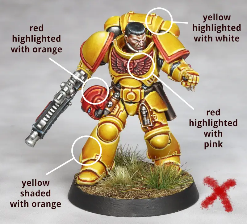
Highlighting Mistake One – Lightening Colours with White
One way that the miniature painter will attempt to create the illusion that more light is hitting a particular surface is to paint that area with the base colour mixed in with some amount of white.
So he may attempt to highlight red by mixing red with some white. The bright red will be treated as a mid tone and the red white mix, pink, will be the highlight. The logic of this is flawed because while white paint reflects more light, making it lighter, it reflects all the frequencies not just the red.
So the overall effect of mixing white with the colour is to de-saturate the colour, the exact opposite of what happens in real life. As we have already seen in real life more light carries more saturation not less, except in extremis.
Exception – Shininess
Certain surfaces reflect light unevenly. In these cases at certain angles the surface may not absorb any frequencies at all, and so reflecting all the white light in particular patches.
This is shininess and is common to metals and glossy surface treatments. To simulate shininess white paint may be used, with the caveat that shiny reflections will not necessarily be from the nearest to the light source.
Highlighting Mistake Two – Lightening with a Different “Lighter” Colour
When the miniature painter realises that there is something amiss in highlighting red with pink or blue with baby blue. He may then think of using a different but “lighter” colour instead to preserve saturation. To highlight red he may try orange or yellow, under the false belief that orange and yellow are lighter colours.
However this is even more wrong than making a pastel out of the base colour. Orange and yellow are their own colours representing different frequencies of light. When a surface gets more light it does not change the frequencies that it absorbs and reflects, it just reflects more of the same frequency.
The best highest highlight for a hue is itself at maximum saturation.

Shading Mistake One – Shading with a Different Colour
This is really the inverse of highlighting with a different colour. The painter will have tried to darken certain colours like red or yellow with black and found the result unsightly.
To get around this he tries to shade with a different but near colour that he imagines is darker than the red or the yellow but not as dark as black. So to darken yellow he will use orange or brown. To darken red he will use brown or mix in a touch of green to make the red a bit brownish.
However as with the highlighting with a different colour this is unnatural and results in an unnatural look. Shadows do not change hue, they only change value and saturation.
In general it is completely correct to darken a colour by mixing it with black. Black will de-saturate a colour and also reduce the value of a colour. This simulates very well what happens in real life when a coloured surface gets less light.
The problem that arises with red and yellow paints is that due to the particular pigments used they tend to be quite translucent. This is while black paints tend to be exceedingly opaque. So when mixing them together the black dominates the red or the yellow too much.
The solution however is to use black very sparingly and very thinned, or use a grey, when shading reds and yellows. Understand the real cause of the problem and the solution is obvious.
As much as possible we should shade by reducing saturation and value together while preserving hue.
Exception – Reflection Lighting
There is a case for shading with a different colour when attempting to create a lighting effect where the shaded area is picking up light reflected from another differently coloured surface.
For example, a yellow object lit from above and sat upon a green field, will reflect away yellow from its highlighted, directly lit surface but will reflect away yellow with a greenish tinge from its shaded side which is partially lit with light reflected from the green field on which it sits.
Solutions to the Mistakes
To get the right colours for the job it can help to dispense with the idea that highlighting is separate from shading. Actually under normal lighting conditions for a matt surface there is only relative degrees of shading. So when painting red, red is a your “highlight” colour and the various degrees of dark red will be your mid tone and shades.
The only exception will be black which of course can not be shaded further. Your highlight then must be dark grey.
Be aware of the translucency of different pigments. The more translucent the paint the more white the canvas under it will need to be and the more sparing of the grey/black one should be to shade it. Also the coverage of translucent pigments can be built up using multiple layers.
Value Sketch
If you use the value sketch method to get your value map of your miniature, you are very close to getting the right colours for your highlights and shades. All you need to do is be aware of the translucency of your paints.
If your translucent colours are not showing up so well, tilt the balance of your sketch up towards the grey and white rather than black for those areas. Add successive layers of the translucent colours to build up their coverage.
Layering
If you use some form of layering technique to build your light map, then try to see the colours that you previously thought of as your mid-tone as your highlight and shade down from there. Ideally you should start from a pure white canvas to ensure your most translucent colours preserve their saturation.
If you dislike white primers because of their chunky pigments, consider priming using a mid-grey and then airbrushing a white ink over it.
In Sum
Always be aware that in natural light saturation follows light intensity. Shadows are not just darker they are also less saturated, and the surfaces catching the most light should be the most saturated.
Learn more about the wargaming hobby by clicking here.